YouTube Explores Different Color Schemes for Premium Subscribers An In-Depth Look
A platform's user interface (UI) is its face to the world. It's an essential part of the user experience (UX), driving how easily and effectively a user can interact with a platform. UI and UX design are constantly evolving fields, with platforms continually innovating and experimenting to offer the best possible user experience. One latest case in point of this: is YouTube and its exploration into alternate color schemes exclusively for premium subscribers.
YouTube and Premium Membership: An Overview
Before we delve into the new feature, let's understand the background of YouTube and its premium services. YouTube, a video-sharing platform owned by Google, was launched in 2005 and has since altered the way we consume video content. YouTube Premium, announced in 2018 as a rebrand of YouTube Red, is a paid subscription service. It offers ad-free playback, access to exclusive content, background play, and the ability to download videos for offline viewing.
Unlocking a New Aesthetic: Different Color Feeds for Premium Members
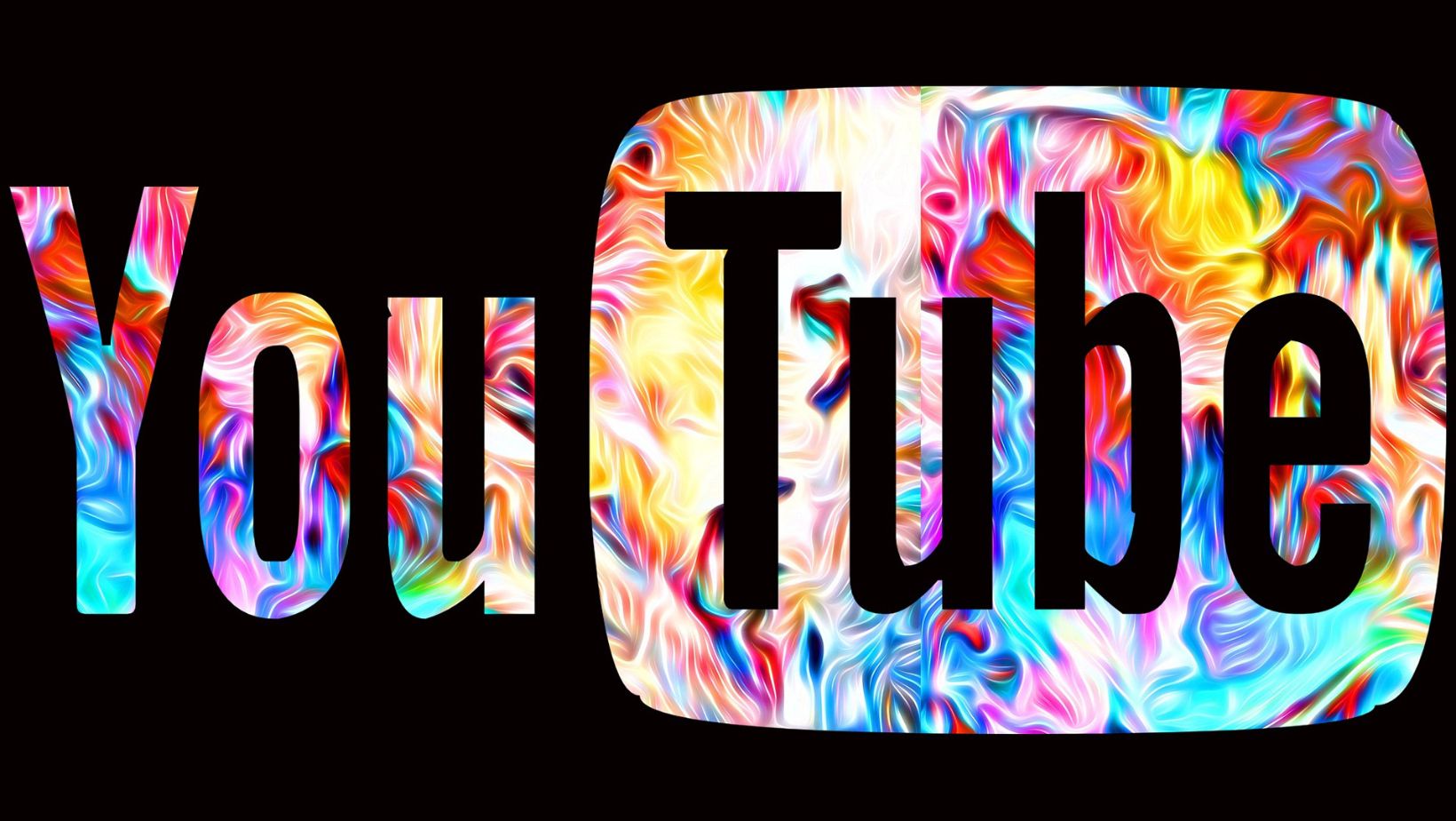
One of the latest tests announced by YouTube involves offering alternate color schemes for premium subscribers. Previously, all YouTube users were constrained to the signature red-and-white color scheme of the platform. This color scheme has always lent brand recognition to the platform, effortless visibility for key elements, and an intuitive navigation experience.
However, YouTube seems to be looking to provide subscribers with more customization options, starting with the option to change the color language of the application.
Why is YouTube Testing Different Color Feeds?
Although no official statements have been made, it's reasonable to speculate on why YouTube is testing different color feeds for its premium users. Most notably:
Increase Perceived Value of the Premium Offering. Enhancing visual appeal and customization options can give a unique and exclusive feel to the premium experience, potentially encouraging more users to depart from the free version.
Improve User Experience. The ability to personalize color schemes may enable a more comfortable or engaging user experience. Varied color schemes may also be more amenable to various lighting conditions, times of day, or accessibility requirements.
Test Before Broad Roll-Out. Testing with premium users, who are often more invested in the platform, allows YouTube to gather valuable feedback and data before possibly rolling out the feature to all users.
User Reactions to the Experiment
The changes to the color feeds will likely elicit a variety of responses from users:
Excitement over Enhanced Customization
There's an appeal in being able to design one's user experience. Having the option to choose between multiple color feeds could offer users a sense of uniqueness and control over their YouTube experience. The new visuals can also freshen up the platform and make it more engaging for users.
Access to Exclusive Features
For premium users, access to experimentation and exclusive features enhances the perceived value of their subscription. The value added by personalized aesthetics may not be substantive, but it certainly contributes to a higher sense of satisfaction among subscribers who can now enjoy yet another upgraded feature.
Criticisms Concerning Prioritization
On the other hand, some members of the YouTube community might express criticism. This group may argue that YouTube's efforts should be focused more on significant functionality improvements than aesthetic alternations. They might perceive the experiment as a deviation from addressing more pressing or valuable features.
Implications of the Test for YouTube's UI/UX Journey
The decision to test alternate color feeds for premium members has broader implications for YouTube’s UI/UX journey:
Further Distinguishing Premium from Regular Users. The ability to customize color schemes provides another differentiator point between Premium and regular users, alongside the existing distinguishing features such as ad-free viewing and access to exclusive content.
Indicating a Step toward Greater Personalization. This test could be the first of many steps towards greater UX personalization on the platform. The introduction of alternate color feeds could pave the way for other customizable UX options, such as adjustable layouts or user-defined categories.
Innovating Within the Constraints of Brand Recognition. The classic red-and-white YouTube interface is globally recognized. By experimenting with alternate color feeds, YouTube is innovating within its UI without losing brand identity, thus striking a balance between maintaining familiarity and introducing novelty.
The results of this test will undeniably provide valuable insights into user preferences around UI personalization, which could then influence future UX decisions and innovations.
Future Directions for UI/UX Optimization
Looking ahead, it's plausible that YouTube will continue to iterate and experiment with its UI. Here are a few areas we expect YouTube might explore:
- Greater Personalization: Following the trend in technology, YouTube might invest more resources in offering personalized user experiences, both visually and functionally.
- Optimization for Different Devices: As users watch YouTube on many different devices, we can expect the platform to consider device-specific UI/UX enhancements.
- Advanced Accessibility Features: Enhancing the app for users with specific needs, such as color filters for visually impaired users or simplified navigation for the elderly, could be an important frontier for YouTube's UI development.
- Improved UI Performance: Technical aspects of the UI such as load times, responsive design elements, or efficient use of screen space are constantly in need of optimization.
YouTube's testing of alternate color schemes for premium members underscores the platform's commitment to refining its user experience and pushing the boundaries of its UI design. Though seemingly a small tweak, this step could pave the way for more pivotal changes in the way YouTube's interface interacts with users and opens the doors to a more personalized user journey.
Of course, the efficacy of this new feature will heavily depend on the outcome of the test and the feedback from users. Will it improve user engagement? Will it encourage more users to switch to Premium? Only time will tell.
As technology advances and user requirements evolve, YouTube, just like any successful platform, will keep upgrading and experimenting with its UI/UX to enhance user satisfaction and engagement.
By closely observing these changes and their impacts, not only can we stay updated on the user-friendly features rolling out, but also gain insights into how UI/UX designs are evolving. These observations can enrich our understanding of digital trends, paving the way for more thrilling user experiences in the future. It's yet another reminder of the exciting times we live in, where even changing colors can create waves in the digital sea.
We'll keep an eye on YouTube's experimentation and how it unfolds. In the meantime, let us embrace the color of change, and keep a keen eye on other innovative shifts on the horizon.